- What is Exabeam?
- Welcome to the Advanced Analytics Homepage
- High-Level Counters on the Advanced Analytics Homepage
- About the Notable Users List
- Watchlists
- Account Lockouts List on the Advanced Analytics Homepage
- Navigate to Other Pages, Sign Out, or Change Password from the Advanced Analytics Homepage
- Use Dark Mode in Advanced Analytics , Case Manager, and Incident Responder
- Change Language in Advanced Analytics, Case Manager, and Incident Responder
- Get to Know a User Profile
- 1 General Information
- 2 Data Insights
- 3 Active Incident(s)
- 4 User Risk Trend
- 5 Risk Reasons
- Get to Know the User Timeline Page
- Examine Events by Category with the User Session Summary
- About the User Session Timeline
- Filter User Timelines
- View Activity Summary on a Specific Day
- Get to Know the Daily Timeline
- View and Understand an Account Lockout Sequence
- Get to Know the Account Lockout Sequence Timeline
- Accepting a Session or Sequence
- Search for a Data Lake Log from an Advanced Analytics Smart Timelines™ Event
- View a Data Lake Log from an Advanced Analytics Smart Timelines™ Event
- Download a Data Lake Log from an Advanced Analytics Smart Timelines™ Event
- Copy Advanced Analytics Event Data to Your Clipboard
- Search Splunk Logs from an Advanced Analytics Smart Timeline™ Session
- Add Advanced Analytics Evidence to a Case Manager Incident
- Entity Analytics
- Get Started with the Asset Page
- Get Started With the Threat Hunter Page
- Search Histograms Using the Data Insights Page
- Monitor Exabeam Processes Using the System Health Page
- Contact Technical Support
Search Histograms Using the Data Insights Page
You can navigate to the Data Insights page from the hamburger menu at the top right corner of the homepage. The Data Insights page allows you to search for histograms by Model Name or Grouping Feature Value (GFV). Searching by Model Name produces all the histograms that utilize the specified model. For example, to search for histograms that model remote logons, search ‘Remote Logon’ and select the desired model.
Searching by GFV yields all histograms that model the specified scope. For example, searching ‘Sales’ returns all histograms that model the users within the Sales group.
Types of Histograms
Each histogram has one of several possible templates or presentations. This section describes each histogram type. The presentation types are as follows:
Table Histogram: presents a list of values and the number of times they were observed.
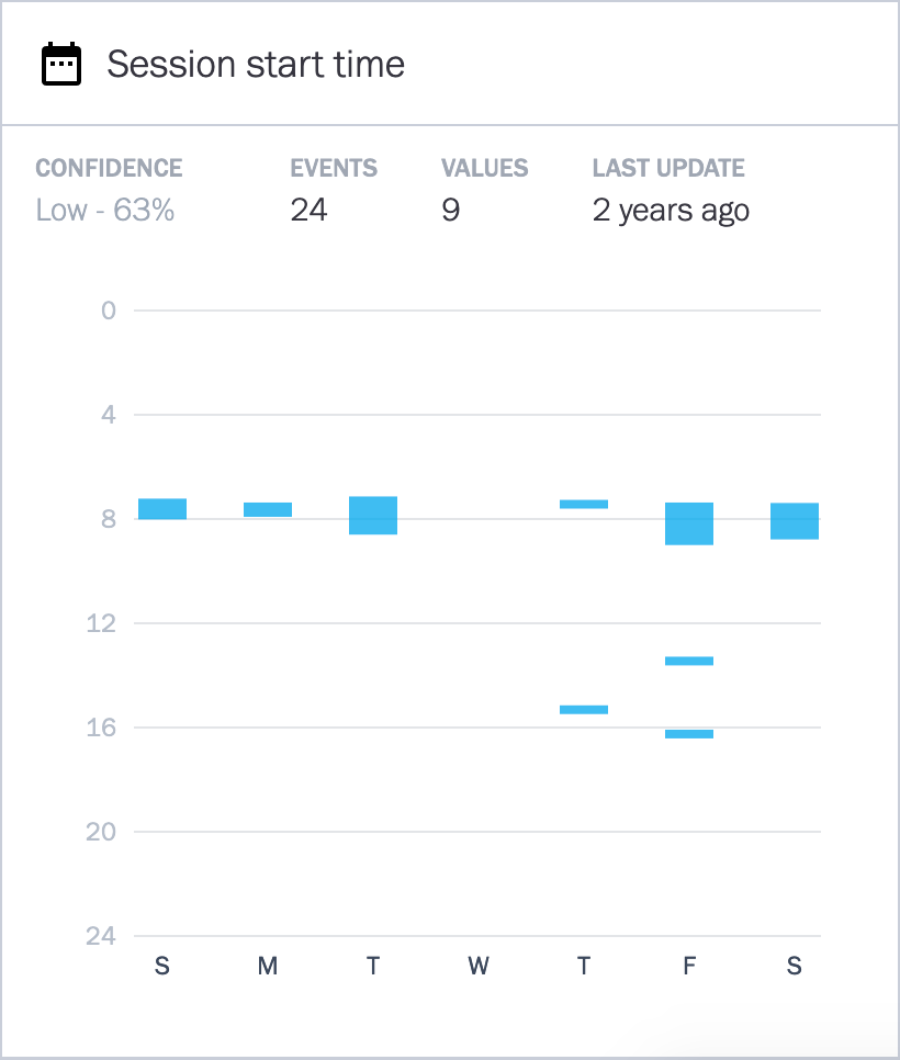
Time of Week: shows blocks of time during the day on one axis, plotted against the days of the week.
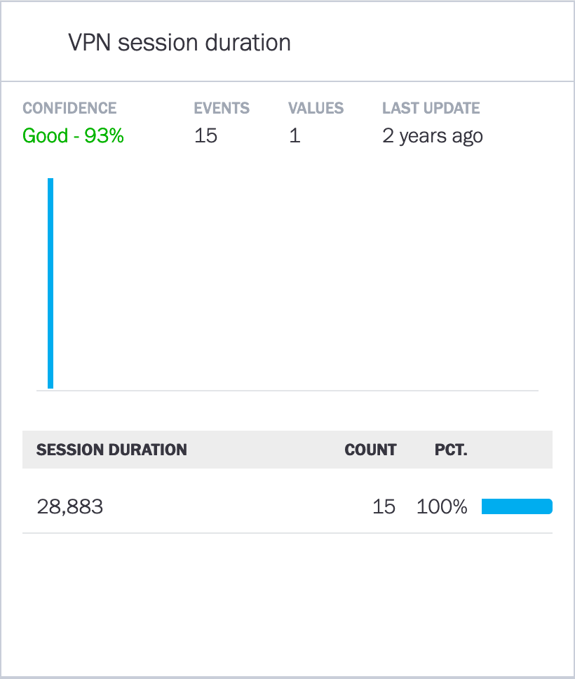
Cluster Histogram: uses a bar to represent ranges of values that constitute a cluster of events.
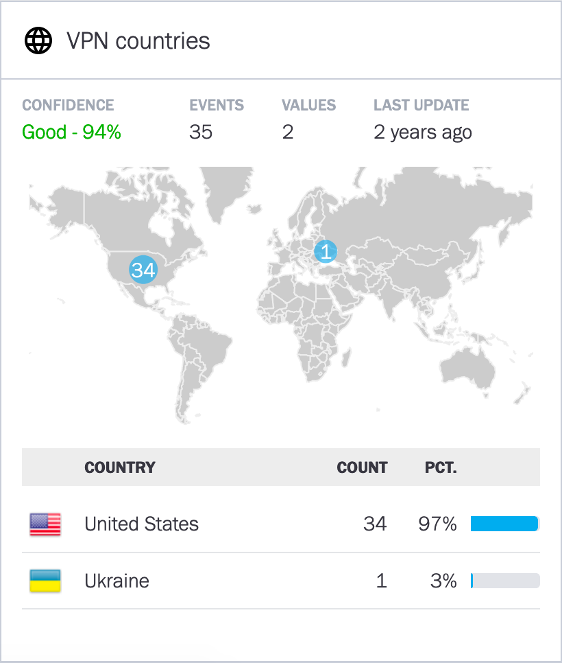
Map (of the world): which, for example, can show countries from which a VPN session was started.
Table Histogram
The table histogram view is used to present categorical histograms. Categorical histograms contain lists of non-numerical data, for example, a list of assets or a list of network zones. The example for a table histogram is the Asset-workstations histogram:
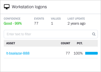 |
This histogram lists all the workstations that User Barbara has logged into.
The top row shows the confidence level Exabeam has for this data (the confidence determines whether Exabeam uses this histogram for anomaly detection; under 80% is not used). The top row also shows a value—the three workstations in this case—that Barbara logged into. This number is the total number of unique assets in the histogram. (In other histograms, the total is for the subject of that histogram.) The Entries value in this example means the total number of times that this user has accessed the three assets (52 times). Last Update shows when the histogram was last updated.
The filter box in the next row is for narrowing the scope of the histogram’s display. As representations of all of a user’s activities, histograms potentially can have hundreds of entries.
The lower part of the histogram gives details. It identifies each asset by name, the number of times each workstation was accessed, and the percent of the total accesses that each workstation represents.
Time of Week
This time of week example shows the number of different start times (25) and the total number session start times (52) during the week. The confidence is low, indicating there is not enough information.
 |
Cluster Histogram
The cluster histogram represents a group of events by a bar, where group is a range of values for an activity. In the example of the start-time histogram in this image, the groups are ranges of hours in which the user starts a session (in another cluster histogram, a group could be the typical set of assets rather than start times). The confidence is high for this histogram, so Exabeam can use it for anomaly detection.
The height of the bars reflects the numbers for session starts in that cluster’s range.
The Values number of 2 means that this user has two different ranges of time that he or she has started all sessions. Visually, the range of each cluster is represented by the width of the bar. The numerical value for the range is represented in the graph but enumerated below the graph.
One range for start times in this example is 5 am – 8 am, and there is a single instance of starting at 1500 hours (3 pm). For 99% of the sessions, the user has started the sessions in the morning hours. The single instance of a 3 pm start is the very small bar at the far right on the horizontal axis.
 |
Map Histogram
The map histogram is a map of the world. In this image, the user has logged onto a VPN from one country, so the Values column shows a 1. The Entries column has 27 to show the number of times this user has logged onto a VPN.
 |
About the Session Data Insights Panel and Page
The Data Insights button is in the upper-right corner of a User Page or Session Timeline Page – selecting it reveals the Data Insights drop-down panel:
The panel view gives a summary of a user’s workstations, assets, zones, countries, and active/inactive times. Hovering over the Time of Week histogram gives more details into the times that the user was active.
Data Insights is a multi-level page that displays histograms (high-level data models) that summarize a user’s activities.
Navigate to the Session Data Insights Page via the More Insights Button
The More Insights button at the bottom of the Session Data Insights panel gives access to the complete Data Insights page of the user. When an analyst clicks More Insights, the default display is the Assets category. This image shows the collapsed categories selection rather the default of Assets:
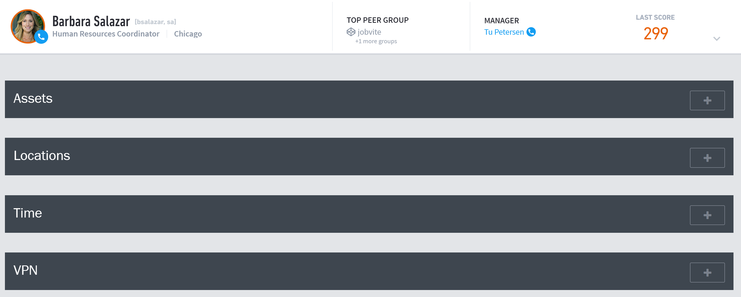
The plus or minus sign near the right edge of the Insight choice is for opening or closing the display for that category of histograms.
The histograms in Data Insights fall into the following main categories:
Assets – computers or devices accessed in the user’s sessions
Locations – network zones or other geo-location related information
Time – session duration or start and end time histograms
VPN – remote access VPN related models
Identities – secondary accounts and credentials of the user
Other Insights – all other activity for the user
