- About Exabeam Data Lake
- Data Lake Search
- Visualize Results in Exabeam Data Lake
- Exabeam Data Lake Dashboard Setup
- Exabeam Data Lake Reports
- Export Limits for Large Volume Exabeam Data Lake Query Results
- Access Restrictions for Saved Objects in Exabeam Data Lake
- How to Forward Alerts Using Correlation Rules in Exabeam Data Lake
- How Correlation Rules Work
- Correlation Rules in Data Lake vs Advanced Detection Rules in Advanced Analytics
- Auto Disable Correlation Rules during High Latency
- How to Find Disabled or Erred Correlation Rules
- Rule Types in Exabeam Data Lake
- Create a Correlation Rule in Exabeam Data Lake
- Correlation Rules Table in Exabeam Data Lake
- Blacklist/Whitelist Correlation Rules using Context Tables in Exabeam Data Lake
- A. Technical Support Information
- B. Supported Browsers
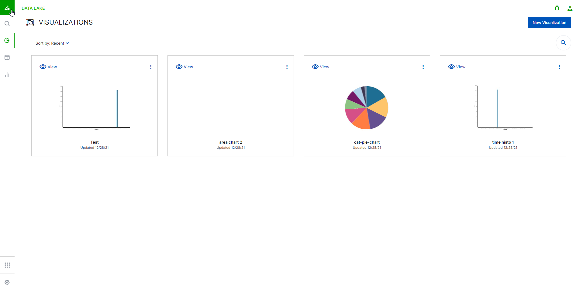
Visualize Results in Exabeam Data Lake
Visualizations are graphic and interpretive representations of the results of one specific search. The Visualizations page is where you create, modify, and view your own custom visualizations.
Visualizations are based on the filters that you set on your data. Data Lakethen performs aggregations and creates distinct representations of the results. There are several different types of visualizations, from charts (bar, line and pie) to data tables. We will cover each of these chart types and their recommended uses. This chapter will also go into some depth on bucket and metric aggregations - concepts that are necessary in order to understand what Visualize is doing with your data.
Visualizations can be shared with other users as well as placed on dashboards in order to display trends you are interested in tracking.
To reach the visualizations page, click the VISUALIZE icon  on the left toolbar.
Create a New Visualization in Exabeam Data Lake
Visualizations are generated from the data queried during its creation or from saved searches. Exabeam offers an array of linear and spatial chart types to present search results.
To create a new visualization:
Click the VISUALIZE icon (
) on the left toolbar.From the Visualizations page, click New Visualization.
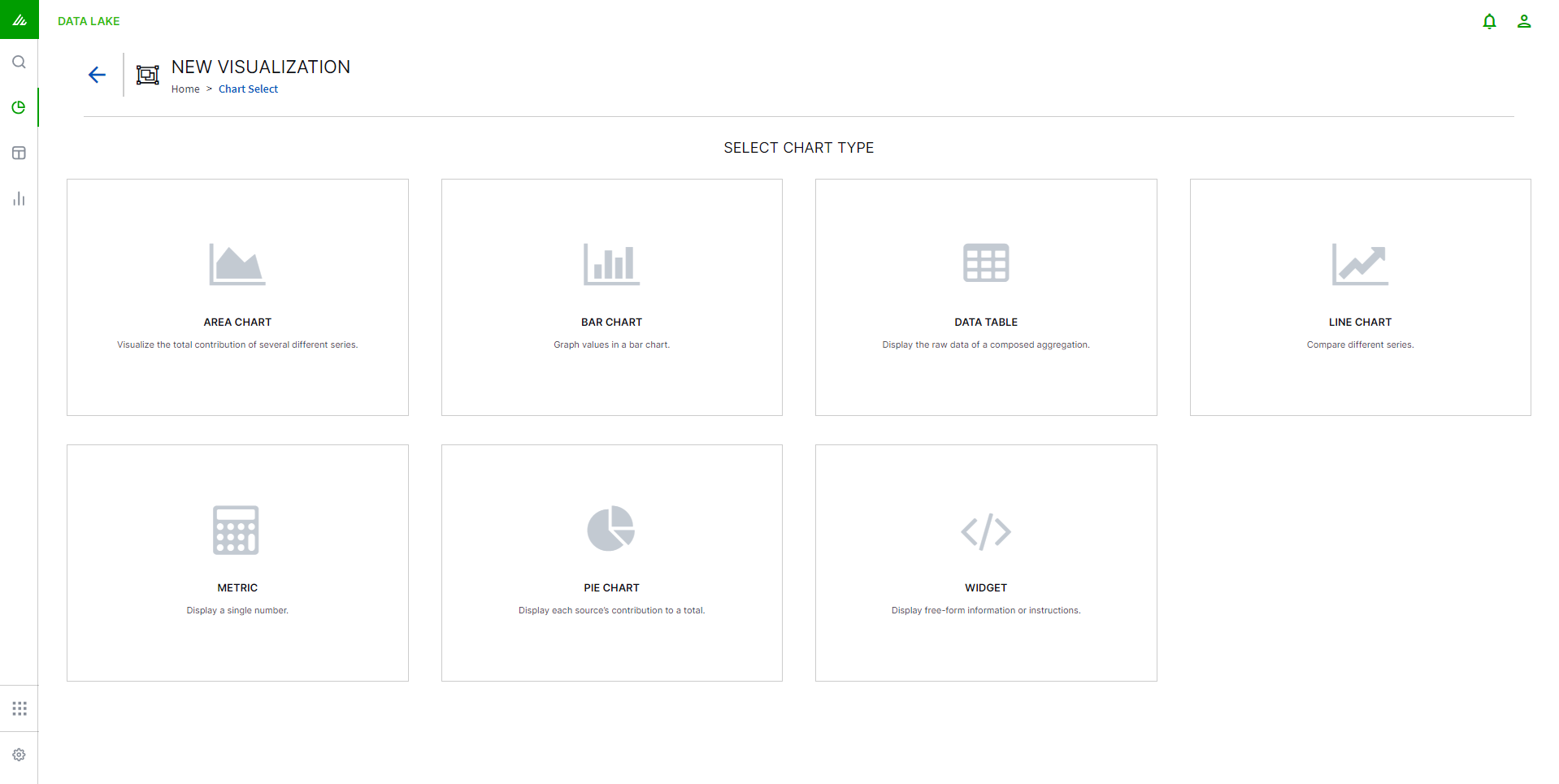
Choose which type of chart you would like to create.
Note
The type of chart can be changed later. For more detailed information on each of the charts and their recommended uses, see Types of Exabeam Data Lake Visualization Charts.

Click New Search to base your visualization on an entirely new search, or Search from Library to base your visualization on an existing search residing in your Search Library.
If you choose to create a visualization from a new search you will be taken to the Search Page. Enter queries using the Lucene query language and Data Lake will use this as a filter on the data. When your search results reflect the data you want to visualize, click Visualize Search.
If you choose to create a visualization from a previously saved search you will be taken to your Search Library. Choose the search you want to visualize and click Visualize.
You will be taken to the Chart Builder page.
Chart Builder in Exabeam Data Lake
Chart Builder is your visualization workbench for creating charts from searches.
Control the data being displayed using Builder Panel 1.
Use the Styles Panel 2 to vary the look and feel of the chart.
Select a color palette 3. Click this to see the different color palettes available.
Create a new visualization 4 .
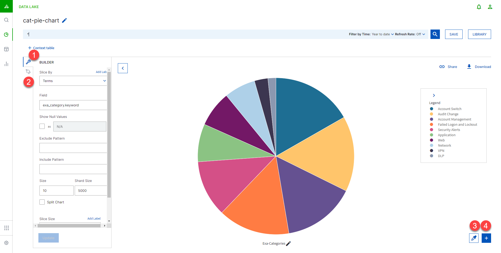
Builder Panel
The information in the Builder panel will change slightly depending on which chart type you've chosen. There are two aggregation types to configure - the Metric Aggregation which configures the Y-axis and the Bucket Aggregation which configures the X-axis.
For example, you could build a bar chart that shows the distribution of events by geographic location by specifying a terms aggregation on the src_country field.
Check the Show Null Values box if you want to include results with empty or null values in any field. These will then be grouped and shown as a separate entry in your visualization. If this is not checked, any results with empty or null fields will be removed from your data.
Note
The Show Null Values feature only works for Terms visualizations and is not available for other types.
See Aggregations for more technical detail regarding how the different aggregations function.
Styles Panel
The information in the Styles panel will change slightly depending on which chart type you've chosen. Here you can choose the line types, the scale, the position of the legend, etc. After making any changes, click Update at the bottom of the panel to see a preview of your chart.
Aggregations in Exabeam Data Lake
There are two separate types of aggregations - bucket and metric. Metrics aggregation happens on the y-axis, while buckets are on the x-axis. To understand how visualizations work it is essential to understand how the system aggregates your data.
In the visualizations the bucket aggregation will usually be used to determine the "first dimension" of the chart (e.g. for a pie chart, each bucket is one pie slice; for a bar chart each bucket will get its own bar). The value calculated by the metric aggregation will then be displayed as the "second dimension" (e.g. for a pie chart, the percentage it has in the whole pie; for a bar chart the actual high of the bar on the y-axis).
Because metric aggregations make more sense when they are run on buckets, we will cover Bucket Aggregations first.
Exabeam Data Lake Bucket Aggregations
Bucket aggregations group all of your events into several buckets, each containing a subset of the indexed events. Which bucket a specific event is sorted into can be based on the value of a specific field, a custom filter, or other parameters.
Date Histogram
The Date Histogram aggregation requires a field of type date and an interval. It will then put all the events into one bucket, whose value of the specified data field lies within the same interval. Besides the easily recognized interval values (minutes, seconds, etc.) there is the value auto. When you select auto the actual time interval will be determined by Data Lake depending on how large you want the histogram to be, so that a reasonable number of buckets will be created.
Example: You can construct a Date Histogram on the event_time or @timestamp field of all messages with the interval minute. This will create a bucket for each minute and each bucket will hold all events that were generated in that minute.
Histogram
A Histogram is similar to a Date Histogram except that it can be used on any numerical field. As with the Date Histogram, you specify a number field and an interval. The aggregation then builds a bucket for each interval and includes all events whose value falls inside this interval.
Example: You can construct a Histogram on the event_code field with the interval of hour. This will create a bucket for each hour and each bucket will hold all events that were generated in that hour.
Range
The Range aggregation is like a manual histogram aggregation. You also need to specify a field of type number, but you have to specify each interval manually. This is useful if you either want differently sized intervals or intervals that overlap.
Example: Filtering on the riskscore field, you can plot the count of critical users (those with a risk score greater than 90), high risk users (those with a risk score between 80 and 90), and non-risky users (those below 80).
Terms
A Terms aggregation creates buckets based on the values of a field. You specify a field (which can be any type) and it will create a bucket for each of the disparate values that exist in that field.
Example: You can run a Terms aggregation on the field src_country which holds the country name of the user. Afterward you would have a bucket for each country and in each bucket the events of all users in the country.
Filters
A Filter aggregation is extremely flexible. You can specify a filter for each bucket and all events that match the filter will be in that bucket. Each filter is a query, as we discussed in the Search chapter of this document. The filter that you specify for each bucket is entirely at your discretion.
Example: You can create a filter aggregation with one query being src_country: canada to see all the events that originated in Canada.
Significant Terms
Significant Terms are "uncommonly common" terms in a set of events. In other words, this aggregation returns unusual or interesting terms in a given subset of events. Given a subset of events, this aggregation finds all of the terms which appear in this subset more often that is expected from term occurrences in the entire events set. It then builds a bucket for each of the significant terms - each bucket contains all the events of the subset in which this term appears. The size parameter controls how many buckets are constructed, i.e. how many significant terms are calculated.
The subset on which to operate the significant terms aggregation can be constructed by a filter or you can use another bucket aggregation first on all events and then choose Significant Terms as a sub-aggregation which is computed for the events in each bucket.
Example: Using the search field at the top to filter events for event_data.FailureReason and setting the size parameter to 5 will return the top 5 most unusual failure reasons for a failed logon.
Date Range
Date Range aggregation is similar to Range aggregation, except that from and to values can be expressed. It is an aggregation dedicated to date values.
The date range expression itself starts with an anchor date, which can either be now, or a date string ending with ||. This anchor date can optionally be followed by one or more expressions.
y | Years |
M | Months |
w | Weeks |
d | Days |
h | Hours (hour of day 1-12) |
H | Hours (hour of day 0-23) |
m | Minutes |
s | Seconds |
now | Current time |
Examples of date expressions:
now-1m/d | The current time minus one month, rounded down to the nearest day. |
2017-01-01||+1M/d | January 1, 2017 plus one month, rounded down to the nearest day. |
Exabeam Data Lake Metric Aggregations
After you have run a bucket aggregation on your data, you will have several buckets with events in them (the x-axis). You now specify one metric aggregation to calculate a single value for each bucket (the y-axis). The metric aggregation will be run on every bucket and result in one value per bucket.
Count
This is not really an aggregation. It just returns the number of events that are in each bucket as a value for that bucket.
Example: If you want to know how many events are from which country, you can use a term aggregation on the field src_country (which will create one bucket per source country) and afterward run a count metric aggregation. Every country bucket will have the number of events as a result.
Average/Sum
For the average and sum aggregations you need to specify a numeric field. The result for each bucket will be the sum of all values in that field or the average of all values in that field respectively.
Example: You can have the same country buckets as above again and use an average aggregation on the user.logons field to get a result of how many logons a user in that country has on average.
Max/Min
Like the average and sum aggregation, this aggregation needs a numeric field to run on. It will return the minimum value or maximum value that can be found in any event in the bucket for that field.
Example: If we use the country buckets again and run a maximum aggregation on the logon_count we would get for each country the highest number of logons a user had in the selected time period.
Unique Count
The unique count will require a field and count how many different/unique values exist in events for that bucket.
Example: This time we will use range buckets on the user.logons field, meaning we will have buckets for users with 1-100, 100-1000 and 1000- events. If we now run a unique count aggregation on the src_country field, we will get for each user's range the number of how many different countries users with x number of events would come. That could show us that there are users from 18 different countries with 1 to 100 events, from 30 different countries for 100 to 1000 events and from 4 different countries for 1000 events and above.
Percentiles
A percentiles aggregation is a bit different, since it won’t result in one value for each bucket, but in multiple values per bucket. These can be shown as different colored lines in a line graph, for example.
When specifying a percentile aggregation, you have to specify a number value field and multiple percentage values. The result of the aggregation will be the value for which the specified percentage of events will be inside (lower) as this value.
Example: You specify a percentiles aggregation on the field src.country_count and specify the percentile values 1, 50 and 99. This will result in three aggregated values for each bucket. Let’s assume we have just one bucket with events in it. The 1 percentile result (and e.g. the line in a line graph) will have the value 7. This means that 1% of all the events in this bucket have a count of 7 or below. The 50-percentile result is 276, meaning that 50% of all the events in this bucket have a count of 276 or below. The 99-percentile have a value of 17000, meaning that 99% of the events in the bucket have a count of 17000 or below.
Types of Exabeam Data Lake Visualization Charts
Area Chart
An area chart displays a time series of logs as a set of points connected by a line, with all the area filled in below the line. This is a stacked chart that displays data contiguously. Commonly used to represent data that occurs over a period of time. Useful for showing proportional data that occurs over time. These charts are good for displaying totals for all series as well as the proportion that each series contributes to the total.
Data Table
A data table will display the raw data that in other visualizations would be rendered into graphs. Each column represents a data field and the rows hold the values for that field.
Data tables are useful for efficiently organizing large amounts of data
Line Chart
A style of chart that is created by connecting a series of data points together with a line. A line chart can give you a fairly good idea of trends over time and are good for high density time series.
Pie Chart
The classic pie chart is perfect for displaying the parts of a whole. Ideally, keep the slices to 7 or fewer in order for the data to be clear and useful.
Vertical Bar Chart
The vertical bar visualization is best suited for visualizations where data on your x-axis is discrete, because each x-axis value will get its own bar(s) and there won’t be any interpolation done between the values of these bars.
You have three bar modes available:
Stacked: this behaves like an area chart; the bars are stacked onto each other.
Percentage: this uses 100% height bars, and only shows the distribution between the different buckets.
Grouped: this places the bars for each x-axis value beside each other.
Metric Visualization in Exabeam Data Lake
A metric visualization displays the result of a metrics aggregation. There is no bucket aggregation done; it will always apply to the whole data set that is currently selected (to change the data set, change the query in the filter box). The only view option that exists is the font size of the displayed number.
Save A Visualization in Exabeam Data Lake
After creating a visualization that you're satisfied with, you'll need to save it.
To save your visualization:
Click SAVE on the toolbar.
From the drop-down menu, select Save to update an existing visualization, or Save As, to save as a brand new visualization.
If you are saving a new visualization, give your visualization a name and title, and click SAVE.
It is important to note that when switching between tabs (Visualize, Search, Dashboard) Data Lake will return you to the same visualization you've been editing. However, the edits are only temporarily retained while the session is open. Unless you save the visualization, any edits will not be persisted in Data Lake.
Saving visualizations is a necessary step for creating Dashboards, as Dashboards are built using your saved visualizations.
Save the visualized results to a PDF file by selecting the  icon. Export limits will apply to large volume search results. For more information on export format, see Export Limits for Large Volume Exabeam Data Lake Query Results .