Dashboards Features Introduced in 2024
November 2024
Feature | Description |
|---|---|
New Pre-Built AI/LLM Dashboards Available | The following pre-built dashboards are available to monitor the use of AI/LLM sites and applications: |
Additional Audit Log Support for Dashboards | Audit logs for the New-Scale Security Operations Platform now include additional dashboard activities. The following types of dashboard events can be accessed via the Query Builder in Basic Search:
For information, see Dashboards in Audit Logs or Visualizations in Audit Logs in the Dashboards Guide. |
October 2024
Feature | Description |
|---|---|
Updates to Visualization Query Filter Operators | In a phased effort to bring consistency to the filter operators in use across Exabeam New-Scale applications, changes have been made this month to the operators available in Dashboard visualizations. Specifically, when creating a visualization filtered by a query that includes an IP datatype field, the following operators are no longer supported: For more information about visualization query filters, see Configure Visualization Query Filters in the Dashboards Guide. |
Improved Measure and Dimension Field Selection for Visualizations | For a more consistent user experience, the categorization of measure and dimension fields for creating a visualization have been simplified. They are reorganized to match the categories already in use for the Basic Search functionality in the Search application. You can now find fields grouped into familiar categories including Common Fields, Custom Fields, Metadata, Anomalies, and Audit Logs. This new categorization of fields is available for selecting both measures and dimensions, and when selecting fields for query filters. In addition, to support easier use of rule-triggered event information when creating visualizations, a new category of fields has been added to both the Dimensions selection panel and the Query Filters field selector. A new Rules category makes it easy to add rule-related fields to your visualization or filter. The Rules category also includes a Mitre labels sub-category. It can be expanded to provide access to further specific fields such as Tactic and Technique. A new expandable Geo IP category of fields is also available. When you hover your cursor over any measure or dimension fields within the new categories, a tooltip is displayed that shows both the field's Common Information Model name and a tooltip description that provides a brief explanation of the field. Some fields may appear in multiple categories. For more information, see Create a Visualization in the Dashboards Guide. |
Audit Logs for Dashboard Visualizations | Audit logs for the New-Scale Security Operations Platform now include specific visualization activities. The following types of visualization events can be accessed via the Query Builder in Basic Search:
For more information, see Visualizations in Audit Logs in the Dashboards Guide. |
September 2024
Feature | Description |
|---|---|
Audit Logs for Dashboards | Audit logs for the Exabeam Security Operations Platform now include specific dashboard activities. The following types of dashboard events can be accessed via the Query Builder in Basic Search:
For more information, see Dashboards in Audit Logs in the Dashboards Guide. |
August 2024
Feature | Description |
|---|---|
Auto-Creating a Visualization from a Natural Language Prompt | As part of Exabeam Nova and its set of AI-driven capabilities, you can now leverage a new natural language prompt to quickly auto-create a dashboard visualization. You can use a natural language prompt in the Dashboard application to describe the data you want to visualize in plain language. Based on this plain language prompt, the measures, dimensions, filters, and even the chart type are configured automatically. NoteThis auto-create option is currently available only for Event model visualizations. If the automatically generated visualization does not produce the data you want to visualize, you can modify the visualization settings manually to produce exactly the desired results. For more information about auto-creating visualizations, see Auto-Create a Visualization from a Natural Language Prompt in the Dashboards Guide. |
July 2024
Feature | Description | |
|---|---|---|
Support for Pivot to Search in Additional Chart Types | You can now drill into more chart data and pivot to view the events in the Search application. The Show in Search option has been added to the following additional chart types: Single Value, Map, and Map Coverage For more information, see View and Interact with Dashboards or View and Interact with Visualizations in the Dashboards Guide. | |
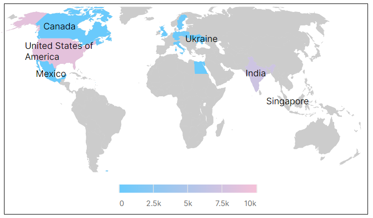
Improved Map Display for Geolocation IP Country Fields | The Map chart type has been improved to display country names. When you create a visualization using a Geo IP Country field as a dimension and a Map chart type, the resulting map will display country names.
For more information about creating visualizations, see Create a Visualization in the Dashboards Guide. |
June 2024
Feature | Description | |
|---|---|---|
Support for Multiple Context Filters in Visualizations | You can now add multiple context filters to your visualizations, enhancing the precision of displayed information. This update supports using up to two context tables simultaneously. This capability ensures that your visualizations are more aligned with specific analysis needs, providing you with accurate and relevant data insights. For more information, see Include Context Filtering in Visualizations in the Dashboards Guide. | |
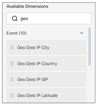
Support for Geolocation IP Fields in Visualizations | You can now add Geolocation IP fields to your visualizations, allowing for the display of detailed IP source and IP destination information in your dashboards. The Geolocation IP fields you can visualize include city, country, latitude, longitude, and ISP. When creating a new visualization for a dashboard, the Geolocation IP fields are available for selection in the lists of measures and dimensions, as shown below.
You can also leverage these fields from the Search application by clicking on a geoIP location field and using the Visualize Field option. For more information about creating visualizations, see Create a Visualization in the Dashboards Guide. |
April 2024
Feature | Description |
|---|---|
Dashboard and Visualization Limits | In Dashboards, the existing maximum limitations are now being enforced for the creation of custom dashboards, visualizations, and folders. These capabilities are available to accounts with the following licenses: Exabeam Security Log Management, Exabeam SIEM, and Exabeam Fusion. The following maximum limitations are applicable:
For more information, see any of the following topics in the Dashboards Guide: |
Pre-Built Dashboards Validation | All available pre-built Exabeam dashboards have been validated to ensure that each visualization is properly filtered and displayed. Where necessary, improvements have been implemented. For more information, see Pre-Built Dashboards in the Dashboards Guide. |
March 2024
Feature | Description |
|---|---|
Delivering Reports as Attachments | You can now opt to schedule a dashboard report so that it's delivered as an email attachment. You can choose to deliver the report attachment as a PDF or in CSV format. You can also assign a name to the attachment file. For more information about scheduling reports, see Create a Scheduled Report in the Dashboards Guide. |
Editing Downloaded Report Names | You can now enter a descriptive report name when you download a dashboard report. For more information, see View and Interact with Dashboards in the Dashboards Guide. |
New Pre-Built Visualizations | Six new pre-built visualizations are now available: |
February 2024
Feature | Description |
|---|---|
Favorites as the Landing Page | To facilitate quickly finding your most frequently used dashboards or visualizations, the Favorites page is now the landing page when you enter either tab in the Dashboards application. As a result, on both the Dashboards and the Visualizations tabs, the items you have marked as favorites are now displayed by default. If no favorites have been defined, the All page is displayed by default. |
Improved Dashboard User Interface | The redesigned Dashboards user interface now includes two main tabs, one for Dashboards and one for Visualizations. Each tab provides single-pane access that is intuitive to navigate. Workflows have been simplified so that all operations are available from a single dashboard or visualization pane. For more information about the new Dashboards interface, see the following sections of the Dashboards Guide: |
Introducing the Visualization Library | Exabeam introduces a new visualization library where reusable visualizations can be created, stored, and accessed for use across multiple dashboards. You can now create visualizations either from within a dashboard or independently from any dashboards. Visualizations in the library can be edited, duplicated, published, added to additional dashboards, and deleted. You can also add visualizations to the library after you've created them in a dashboard. For more information about the visualization library, see Configure and Manage Visualizations in the Dashboards Guide. |
New Pre-Built Visualizations | As part of the new visualization library feature, Exabeam now provides a set of pre-built visualizations. To access these visualizations, navigate to the Visualizations tab in Dashboards, click the Created by filter menu, and select the Exabeam filter option. You can add these pre-built visualizations to dashboards as they are, or you can use them as templates to create your own visualizations. For more information, see Pre-Built Visualizations in the Dashboards Guide. |
January 2024
Feature | Description |
|---|---|
Introducing Five New Pre-built Dashboards | Five new pre-built dashboards are now available: |

