- Dashboards
- Navigation Overview
- View and Interact with Dashboards
- View and Interact with Visualizations
- User Management
- Configure and Manage Dashboards
- Create a Dashboard
- Add a Visualization to a Dashboard
- Add a Text Tile
- Modify a Dashboard Layout
- Add Dashboard Filters
- Manage Automatic Refresh Rates
- Create a Scheduled Report
- Make a Dashboard Public
- Export and Import Dashboards
- Edit Dashboard Filters
- Edit Dashboard Details
- Duplicate a Dashboard
- Delete a Dashboard
- Configure and Manage Visualizations
- Create a Visualization
- Auto-Create a Visualization from a Natural Language Prompt
- Create a Visualization from a Search Query
- Add Visualizations from the Library to a Dashboard
- Modify a Visualization
- Configure Visualization Query Filters
- Include Context Filtering in Visualizations
- Make a Visualization Public
- Export and Import Visualizations
- Duplicate a Visualization
- Remove a Visualization from a Dashboard
- Delete Visualizations from the Library
- Configure and Manage Scheduled Reports
- Pre-Built Dashboards
- Advanced Analytics
- AI/LLM Dashboards
- Case Manager
- Compliance
- CMMC - Analyst Dashboard
- CMMC - Management Dashboard
- HIPAA - Analyst Dashboard
- HIPAA - Management Dashboard
- ISO 27001 - Analyst Dashboard
- ISO 27001 - Management Dashboard
- NIST 800-53 - Analyst Dashboard
- NIST 800-53 - Management Dashboard
- NIST 800-171 - Analyst Dashboard
- NIST 800-171 - Management Dashboard
- NIST CSF - Analyst Dashboard
- NIST CSF - Management Dashboard
- PCI DSS - Analyst Dashboard
- PCI DSS - Management Dashboard
- Correlation Rules
- Event Store
- Access Grant and Revoke Activity Dashboard
- Account Logout Summary Dashboard
- Account Management Activity Dashboard
- Application Security Event Summary Dashboard
- Authenticated User Accounts on Hosts Dashboard
- AWS CloudTrail Summary Dashboard
- Data Loss Prevention Activity Dashboard – Host-Based
- Data Loss Prevention Activity Dashboard – User-Based
- Data Loss Prevention Activity Summary Dashboard
- Default Account Access Dashboard
- Default Credential Usage and Change Activity Dashboard
- Denied Web Access Activity Dashboard
- Disabled User Account Summary Dashboard
- Discovered Attacks by Source and Destination Dashboard
- Endpoint Detection and Response Dashboard
- Failed Application Logon Activity Dashboard
- Failed Audit Logs Summary Dashboard
- Failed Host Login Attempt Counts by Users Dashboard
- Failed VPN Login Attempts and Remote Session Timeouts Dashboard
- Firewall Activity Dashboard
- Firewall and Router Device Interfaces Dashboard
- Indicator of Compromise (IOC) Statistics Dashboard
- Insecure Authentication Attempts Dashboard
- Microsoft 365 Summary Dashboard
- Microsoft Windows Overview Dashboard
- Network Applications by Traffic Volume Dashboard
- Policy Activity Summary Dashboard
- Port Usage Trends Dashboard
- Privileged Access Dashboard
- Privileged Access Dashboard – User-Based
- Protocols by Network Traffic Dashboard
- Remote Session Overview Dashboard
- Security Alert Summary Dashboard – Impacted Hosts
- Security Alert Summary Dashboard – Origin Hosts
- Security Alert Summary Dashboard – Users
- Successful Application Logon Activity Dashboard
- Successful Database Login Activity Dashboard
- Successful Physical Access Dashboard
- Top Attackers Dashboard
- User Account Creation Summary Dashboard
- User Account Lockout Activity Dashboard
- Vendor Authentication Activity Dashboard
- Windows Audit Failure Summary by Hosts Dashboard
- Windows Audit Failure Summary by Users Dashboard
- Windows User Privilege Elevation Dashboard
- Zscaler HTTP Dashboard
- SOC Management
- Threat Center
- Pre-Built Visualizations
- Anomalies - Use Case & MITRE Coverage
- Anomalies by Rule Name
- Anomalies by Use Case
- Anomalies Count Over Time
- Anomaly Distribution by MITRE Tactic & Score
- Application Count
- Closed Incidents
- Correlation Rules by Severity
- Correlation Rules Triggered Over Time
- Detected Anomalies
- Host-Based DLP Alerts Count
- Incidents Created
- Incident Summary by Incident Type
- Number of Hosts with DLP Alerts
- SOC Incident Distribution
- Top 5 Host-Based DLP Alert Categories
- Top 5 Protocols in Host-Based DLP Alerts
- Top 10 Host-Based DLP Alert Types
- Top 10 Hosts with DLP Alerts
- Top Activities per Top 10 Applications
- Top Users per Top 10 Applications
- Trend of Application Security Events
Security Operation Center Overview Dashboard
This pre-built dashboard provides security operation center (SOC) administrators and security leaders with an overview of the entire security posture of their enterprise. It includes dashboards that allow administrators and CISOs to quickly visualize the overall status of their SOC operations and identify areas that need attention.
Note
This dashboard is available with the following licenses:
Exabeam Security Investigation
Exabeam Security Analytics
Exabeam Fusion
The dashboard includes charts that visualize various aspects of incidents, anomalies, and correlation rules. By default it includes three filters that filter the data displayed to the last seven days. It contains filters for incident create date, anomaly approx log date, and correlation rules approx log date.
To modify the filters, click the expand arrow ( ) at the far right of the Filters applied panel. When the panel fully expands, click in a filter field and select a different preset time range or define a custom range.
The sections below described each visualization included on the dashboard.
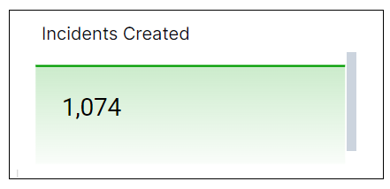
Incidents Created
This single value bar chart displays the total number of incidents created during the specified time range.
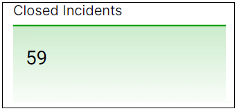
Closed Incidents
This single value bar chart displays the total number of incidents closed during the specified time range.
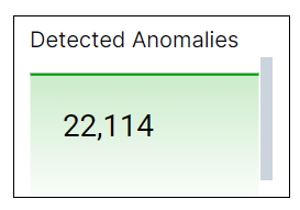
Detected Anomalies
This single value bar chart displays the total number of anomalies detected during the specified time range.
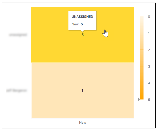
SOC Incident Distribution
This heat map breaks down the count of new incidents per assignee. Darker shading on the map indicates a greater number of incidents. To display more information about a graph value, hover your pointer over a specific square, as shown in the image below.
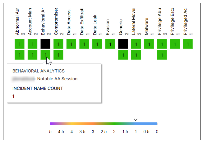
Incident Summary by Incident Type
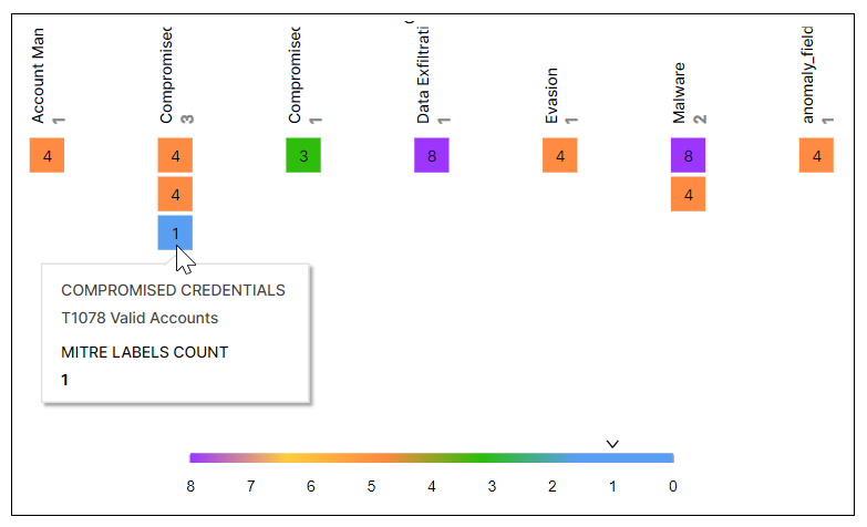
This coverage map shows the distribution of incidents by incident types. The numbers on the squares indicate the number of times that the incident has occurred, and the different colors represent number ranges that are given in the legend. Hover your pointer over the squares to display the incident names.
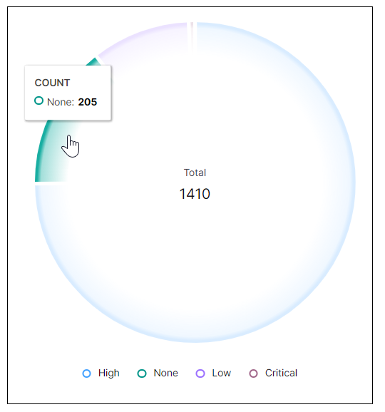
Correlation Rules by Severity
This pie chart illustrates the count proportions of the alerts triggered by correlations rules, grouped by severity. To view the represented values, hover your pointer over the graph slices, as shown in the image below.
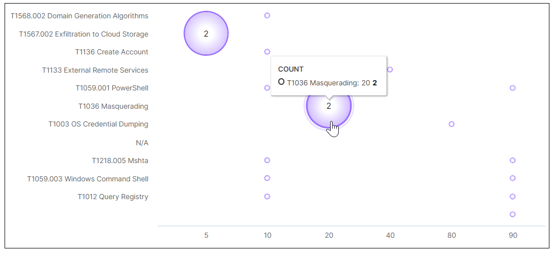
Anomaly Distribution by MITRE Tactic & Score
This bubble chart shows the distribution of anomalies by MITRE tactic and risk score. The MITRE tactics are listed on the left and the possible scores are listed along the bottom. The size of the bubbles is relative based on the number of anomalies detected for a specific MITRE tactic. To view the values represented in each bubble, hover your pointer over it as shown in the image below.
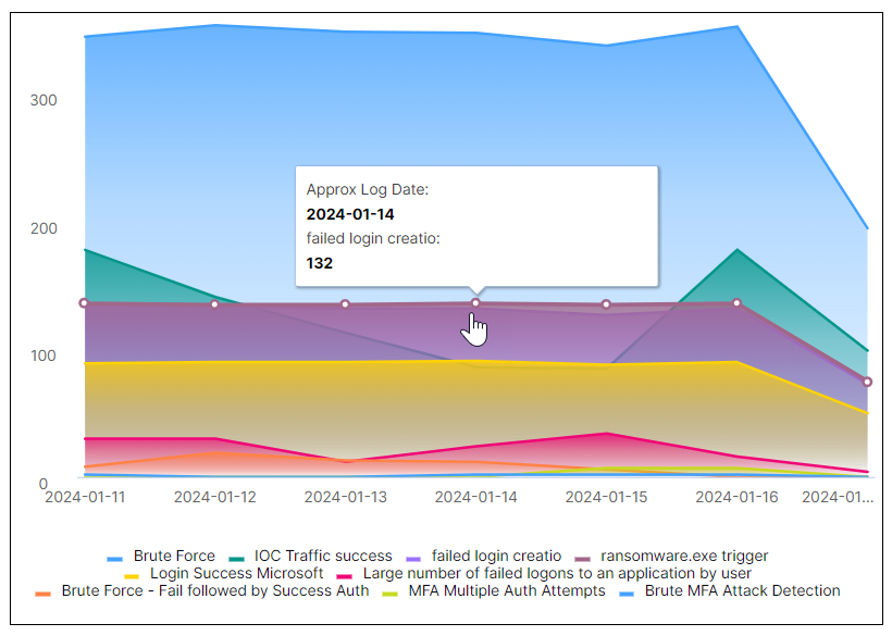
Correlation Rule Triggered Over Time
This area chart represents the count changes of the different correlation rules triggered over the selected time range. Each correlation rule is represented by a color, as shown in the legend below the chart. Hover your pointer over a graph area to highlight it and display the data points. When you hover over a data point, you can information about it, such as the approx log date and number of times it was triggered.
Anomalies – Use Case & MITRE Coverage
This coverage map shows the distribution of detected anomalies by use case and MITRE tactics. The numbers on the squares indicate the number of times that the anomaly was detected, and the different colors represent number ranges that are given in the legend. Hover your pointer over the squares to display the use cases and MITRE tactics.