- Service Health and Consumption Overview
- Service Health
- License View
- Notifications and Alerts
License View
The License View dashboard provides details on your Exabeam subscription and displays charts that compare your data consumption levels with your purchased data amounts.
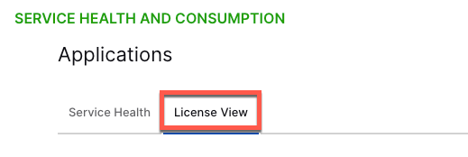
To access the License View dashboard, click the License View tab.

Subscription Details
The dashboard displays details about your Exabeam subscription, including your licenses, correlation rules, add-ons, data limits, retention limits, and storage limits. Using the Export PDF option, you can download all dashboard details as a PDF file.

Timeframe and Format Filters
The License View page includes separate timeframe filters for the Consumption, API Consumption, and Long-Term Consumption charts.
To change the filter settings for a chart, click the filter icon and select a timeframe and/or data format (if applicable) from the menu.

Timeframe options for the Consumption and API Consumption charts include the following:
Prior 7 days – Displays data from the previous seven days. For example, if you were viewing the dashboards on July 8th, you would see data from July 1st through July 7th. Dates are based on UTC time.
Month to date – Displays daily data totals (or average EPS or GB per day if applicable) from the beginning of the current month to the previous day.
Prior calendar month – Displays daily data totals (or average EPS or GB per day if applicable) from the previous month. For example, if you were in the month of October, this option would display data from the entire month of September.
Prior 3 calendar months – Displays the data totals (or average EPS or GB per day if applicable) in three-day increments over the last three calendar months. For example, if you were in the month of October, this option would display data from July through September.
Prior 12 calendar months – Displays monthly data totals (or average EPS or GB per day if applicable) from the last 12 calendar months. For example, if you were viewing the dashboards during the month of October 2023, this option would display data from October 2022 through September 2023.
All months – Displays monthly data totals (or average EPS or GB per day if applicable) from the start of your subscription through the previous month.
Custom date range – Displays data totals (or average EPS or GB per day if applicable) for the date rage that you defined by providing a start date and end date in the range filter. Ensure that the selected date range is 92 days or shorter.
In addition to the timeframe settings, for the Consumption charts, you can select from the following data formats:
Total Events
Average EPS (events per second)
Average GB per day
The Long-Term Consumption chart includes the following timeframe options:
Prior 7 days – Displays data from the previous seven days. For example, if you were viewing the dashboards on July 8th, you would see data from July 1st through July 7th. Dates are based on UTC time.
Prior 30 days: Displays data from the previous 30 days. For example, if you were viewing the dashboards on March 31st, you would see data from March 1st through March 30th. Dates are based on UTC time.
Consumption Charts
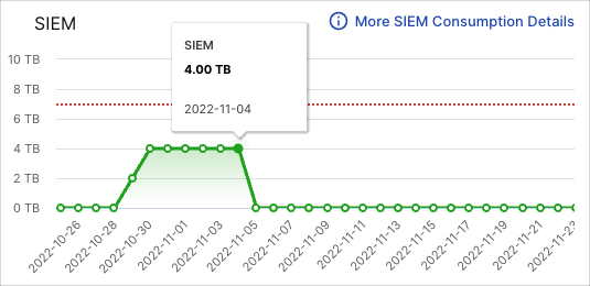
The consumption area charts (which vary depending on your subscription) compare your data consumption with your purchased data amounts over the specified time range.
The red dotted line in the chart shows the amount of purchased data available each day. The green area shows the amount of data that was consumed over the timeframe. To view the actual values of the consumed data, hover your pointer over the green graph line.

For a detailed breakdown of the consumed data, click More <product> Consumption Details. For documentation on the consumption details dashboard, see Consumption Details.
API Consumption Chart
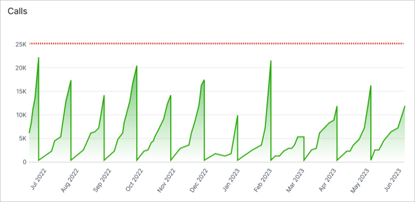
The API Consumption line chart compares your API call data consumption with your licensed data allotment. Use this chart to monitor API consumption trends for potential changes in your data needs.
The red dotted line in the chart shows the amount of API call data available each day. The green area shows the amount of data that was consumed over the timeframe. To view the values of the consumed call data, hover your pointer over the graph line.

For a detailed breakdown of the consumed data, click API Consumption Details. For documentation on the API Consumption Details dashboard, see API Consumption Details.
Long-Term Consumption Chart
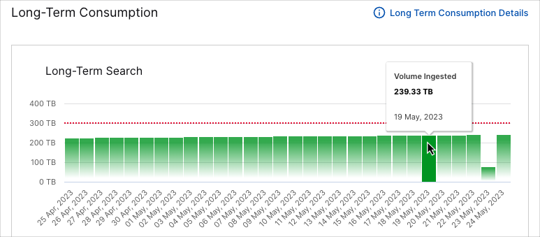
The Long-Term Search column chart displays daily data consumption volumes and compares them to your purchased data limit. Use this chart to monitor Long-Term Search consumption trends for changes in your retention needs.
The green columns represent the total volume of data being consumed each day. To view the represented values, move your pointer over the columns. The red dotted line shows the amount of purchased data available.

For more information on Long-Term Search data consumption and to access the global retention settings, click the Long-Term Consumption Details link. For documentation on the Long-Term Consumption Details dashboard, see Long-Term Consumption Details.
