- Service Health and Consumption Overview
- Service Health
- License View
- Notifications and Alerts
Collection Health Details
You can monitor the health of your cloud-native collectors from the Service Health and Consumption app on the New-Scale Security Operations Platform. To view detailed information about the health of the different types of cloud-native collectors in your deployment, open the Service Health tab and then click Collection Health Details.

Note
The Service Health and Consumption app receives on-premises data only from New-Scale Site Collectors. Site collectors released prior to July 2022 are not supported.
Time Range Filter
By default, the Collection Health dashboard displays results for the last 30 days. To customize the timeframe for all charts on the dashboard, you can apply a time range filter. The following filter settings are available:
Prior 1 day: This option displays data from the previous day (12:00 AM to 11:59 AM UTC).
Prior 7 days – Displays data from the previous seven days. For example, if you were viewing the dashboards on July 8th, you would see data from July 1st through July 7th. Dates are based on UTC time.
Prior 30 days: Displays data from the previous 30 days. For example, if you were viewing the dashboards on March 31st, you would see data from March 1st through March 30th. Dates are based on UTC time.
Prior 12 calendar months – Displays monthly data totals (or average EPS or GB per day if applicable) from the last 12 calendar months. For example, if you were viewing the dashboards during the month of October 2023, this option would display data from October 2022 through September 2023.
To change the filter setting, on the upper-left side of the dashboard, click the filter icon and select a timeframe from the menu.

Current Status Charts

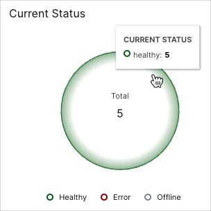
The Current Status pie charts break down the collectors by their statuses (healthy, error, or offline). Hover your pointer over the slices in the chart to view the values represented.
Collectors Uptime Trends
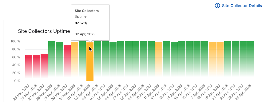
The cloud and site collector uptime bar charts show the rise and fall of uptimes over the selected time range. Uptime percentages reflect the percentage of working collectors within your deployment at the different points in time. Green graph bars indicate that services were running OK during their time periods. If services have been impacted, the graph turns red; when service impacts are minor, the graph turns yellow. From the chart timeline you can see if you're dealing with current issues that need to be addressed, or previous issues.
To view the values represented in the chart, hover your pointer over the graph bars.

