- Service Health and Consumption Overview
- Service Health
- License View
- Notifications and Alerts
Processing Health Details
For detailed information on the health of the different types of processors in your deployment, open the Service Health tab and then click Processing Health Details.

The Processing Health Details dashboard breaks down processors by parsers, event builders, context management, and analytics.
Time Range Filter
The Processing Health Details dashboard includes a time range filter that applies to all charts on the dashboard. The filter's default setting is last 30 days. The following filter settings are available:
Prior 1 day: This option displays data from the previous day (12:00 AM to 11:59 AM UTC).
Prior 7 days – Displays data from the previous seven days. For example, if you were viewing the dashboards on July 8th, you would see data from July 1st through July 7th. Dates are based on UTC time.
Prior 30 days: Displays data from the previous 30 days. For example, if you were viewing the dashboards on March 31st, you would see data from March 1st through March 30th. Dates are based on UTC time.
Prior 12 calendar months – Displays monthly data totals (or average EPS or GB per day if applicable) from the last 12 calendar months. For example, if you were viewing the dashboards during the month of October 2023, this option would display data from October 2022 through September 2023.
To change the filter setting, on the upper-left side of the dashboard, click the filter icon and select a timeframe from the menu.

Total Uptimes
The single value bar charts show the average uptime for the parser, event builder, and analytics processors over the selected time range. A green graph indicates that services are OK. If services have been impacted, the graph turns red; when service impacts are minor, the graph turns yellow. You can see when the health issues occurred in the Uptime column chart to the right (see Uptime Trends).

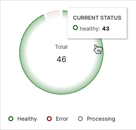
Context Management Current Status
This pie chart displays the total number of context tables in your system and breaks them down by their current status (healthy, error, and processing). To view the number of tables in each status, hover your pointer over the chart slices.

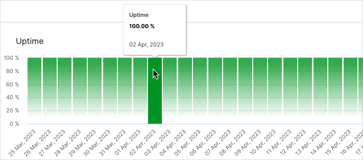
Uptime Trends
The Uptime bar charts show the rise and fall of processor uptimes over the selected time range. Green graph bars indicate that services were running OK during their time periods. If services have been impacted, the bar turns red; when service impacts are minor, the bar turns yellow. From the chart you can determine if you're dealing with current health issues that need to be addressed, or previous issues.
To view the values represented in the chart, hover your pointer over the graph bars.

