- Service Health and Consumption Overview
- Service Health
- License View
- Notifications and Alerts
Service Health
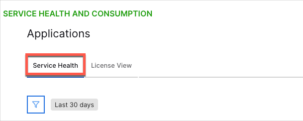
The Service Health page provides visibility into the health and uptime of your collectors, processors, and Exabeam applications. To access this page, select the Service Health tab.

If health issues arise in your Exabeam deployment, a Status Summary notification displays in the heading area with links to the relevant status pages for the issues you are experiencing. The following is an example of the notification:

If a health issue has been detected within your deployment, the notification includes a My Status link that directs you to a SorryApp status page with details on your issue(s).
If your deployment is affected by known regional issues, the notification includes a Global Status link that directs you to a Status.io page to keep you informed of outages and maintenance activities.
Note
If there are no known issues affecting your deployment, the Status Summary notification does not display.
Timeframe Filter
The Service Health dashboard has a time range filter that applies to all charts on the dashboard. Time and dates are based on UTC time. The default setting is last 30 days. The following settings are available:
Prior 1 day: This option displays data from the previous day (12:00 AM to 11:59 AM UTC).
Prior 7 days – Displays data from the previous seven days. For example, if you were viewing the dashboards on July 8th, you would see data from July 1st through July 7th. Dates are based on UTC time.
Prior 30 days: Displays data from the previous 30 days. For example, if you were viewing the dashboards on March 31st, you would see data from March 1st through March 30th. Dates are based on UTC time.
Prior 12 calendar months – Displays monthly data totals (or average EPS or GB per day if applicable) from the last 12 calendar months. For example, if you were viewing the dashboards during the month of October 2023, this option would display data from October 2022 through September 2023.
To change the filter setting, on the upper-left side of the dashboard, click the filter icon and select a timeframe from the menu.

Collection, Processing, and Applications Health Charts
Total Uptime
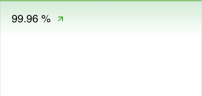
The single value bar charts show the average uptime over the selected time range for your cloud-native collectors, processors, and applications. If services have been impacted, the graph turns red; when service impacts are minor, the graph turns yellow. You can see when the health issues occurred on the Uptime area chart to the right (see Uptime Trends).

Uptime Trends
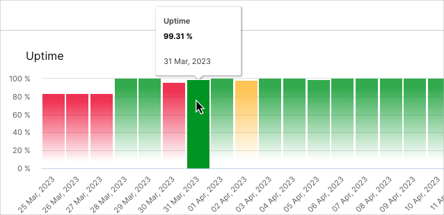
The Uptime bar charts display the rise and fall of uptimes for collectors, processors, and applications over the selected time range. If services have been impacted, the graph turns red; when service impacts are minor, the graph turns yellow. From the graph line you can determine if you're dealing with a current issue that needs to be addressed, or a previous issue.
To view the values represented in the chart, hover your pointer over the graph bars.

Access Health Details
To access more detailed health information on these components, click the following links located above their area charts:
Collection Health Details
Processing Health Details
Applications Health Details
For documentation on the details pages, see Collection Health Details, Processing Health Details, and Applications Health Details.
