- Dashboards
- Navigation Overview
- View and Interact with Dashboards
- View and Interact with Visualizations
- User Management
- Configure and Manage Dashboards
- Create a Dashboard
- Add a Visualization to a Dashboard
- Add a Text Tile
- Modify a Dashboard Layout
- Add Dashboard Filters
- Manage Automatic Refresh Rates
- Create a Scheduled Report
- Make a Dashboard Public
- Export and Import Dashboards
- Edit Dashboard Filters
- Edit Dashboard Details
- Duplicate a Dashboard
- Delete a Dashboard
- Configure and Manage Visualizations
- Create a Visualization
- Auto-Create a Visualization from a Natural Language Prompt
- Create a Visualization from a Search Query
- Add Visualizations from the Library to a Dashboard
- Modify a Visualization
- Configure Visualization Query Filters
- Include Context Filtering in Visualizations
- Make a Visualization Public
- Export and Import Visualizations
- Duplicate a Visualization
- Remove a Visualization from a Dashboard
- Delete Visualizations from the Library
- Configure and Manage Scheduled Reports
- Pre-Built Dashboards
- Advanced Analytics
- AI/LLM Dashboards
- Case Manager
- Compliance
- CMMC - Analyst Dashboard
- CMMC - Management Dashboard
- HIPAA - Analyst Dashboard
- HIPAA - Management Dashboard
- ISO 27001 - Analyst Dashboard
- ISO 27001 - Management Dashboard
- NIST 800-53 - Analyst Dashboard
- NIST 800-53 - Management Dashboard
- NIST 800-171 - Analyst Dashboard
- NIST 800-171 - Management Dashboard
- NIST CSF - Analyst Dashboard
- NIST CSF - Management Dashboard
- PCI DSS - Analyst Dashboard
- PCI DSS - Management Dashboard
- Correlation Rules
- Event Store
- Access Grant and Revoke Activity Dashboard
- Account Logout Summary Dashboard
- Account Management Activity Dashboard
- Application Security Event Summary Dashboard
- Authenticated User Accounts on Hosts Dashboard
- AWS CloudTrail Summary Dashboard
- Data Loss Prevention Activity Dashboard – Host-Based
- Data Loss Prevention Activity Dashboard – User-Based
- Data Loss Prevention Activity Summary Dashboard
- Default Account Access Dashboard
- Default Credential Usage and Change Activity Dashboard
- Denied Web Access Activity Dashboard
- Disabled User Account Summary Dashboard
- Discovered Attacks by Source and Destination Dashboard
- Endpoint Detection and Response Dashboard
- Failed Application Logon Activity Dashboard
- Failed Audit Logs Summary Dashboard
- Failed Host Login Attempt Counts by Users Dashboard
- Failed VPN Login Attempts and Remote Session Timeouts Dashboard
- Firewall Activity Dashboard
- Firewall and Router Device Interfaces Dashboard
- Indicator of Compromise (IOC) Statistics Dashboard
- Insecure Authentication Attempts Dashboard
- Microsoft 365 Summary Dashboard
- Microsoft Windows Overview Dashboard
- Network Applications by Traffic Volume Dashboard
- Policy Activity Summary Dashboard
- Port Usage Trends Dashboard
- Privileged Access Dashboard
- Privileged Access Dashboard – User-Based
- Protocols by Network Traffic Dashboard
- Remote Session Overview Dashboard
- Security Alert Summary Dashboard – Impacted Hosts
- Security Alert Summary Dashboard – Origin Hosts
- Security Alert Summary Dashboard – Users
- Successful Application Logon Activity Dashboard
- Successful Database Login Activity Dashboard
- Successful Physical Access Dashboard
- Top Attackers Dashboard
- User Account Creation Summary Dashboard
- User Account Lockout Activity Dashboard
- Vendor Authentication Activity Dashboard
- Windows Audit Failure Summary by Hosts Dashboard
- Windows Audit Failure Summary by Users Dashboard
- Windows User Privilege Elevation Dashboard
- Zscaler HTTP Dashboard
- SOC Management
- Threat Center
- Pre-Built Visualizations
- Anomalies - Use Case & MITRE Coverage
- Anomalies by Rule Name
- Anomalies by Use Case
- Anomalies Count Over Time
- Anomaly Distribution by MITRE Tactic & Score
- Application Count
- Closed Incidents
- Correlation Rules by Severity
- Correlation Rules Triggered Over Time
- Detected Anomalies
- Host-Based DLP Alerts Count
- Incidents Created
- Incident Summary by Incident Type
- Number of Hosts with DLP Alerts
- SOC Incident Distribution
- Top 5 Host-Based DLP Alert Categories
- Top 5 Protocols in Host-Based DLP Alerts
- Top 10 Host-Based DLP Alert Types
- Top 10 Hosts with DLP Alerts
- Top Activities per Top 10 Applications
- Top Users per Top 10 Applications
- Trend of Application Security Events
CMMC - Analyst Dashboard
This analyst dashboard supports the Cybersecurity Maturity Model Certification (CMMC) requirements. It visualizes information and trends that are necessary for active monitoring and compliance reporting. Each visualization on the dashboard is labeled with the number of the key control it supports from the standard. For detailed information about each visualization, \click the following links to the appropriate sections below:
Note
Usage Requirement
Some of the visualizations on this dashboard rely on data in a specific compliance context table. These are noted in the descriptions below. To use those visualizations successfully, make sure you have entered the necessary information in the specified context table in the Context Management application. The context tables are empty by default until you populate them with data. For more information, see Pre-Built Compliance Context Tables in the Context Management Guide.
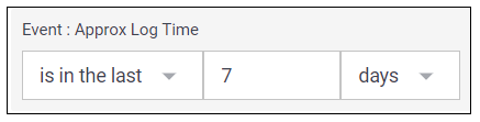
By default, the dashboard is configure to show data for a date range of the last seven days. However, you can update the Event : Approx Log Time filter at the top of the dashboard to select a different range of data. To update the time range filter, click the arrow ( ) on the right, under the Edit button, to expand the filters panel. In the Event : Approx Log Time filter, select an operator from the first drop down menu and then enter or select values in the subsequent fields, depending on the operator you selected. To save your filter changes, click Apply on the right side of the filter panel. The updated filter is applied to the visualization.
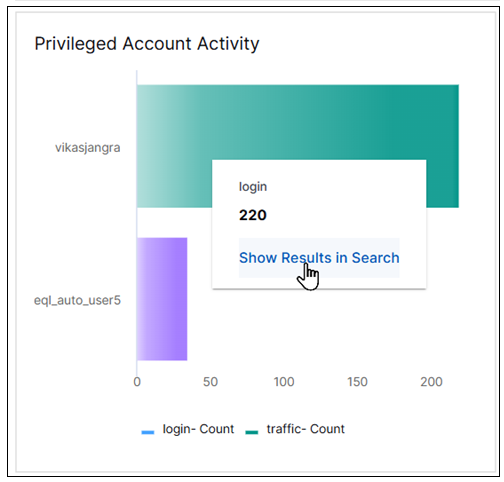
Privileged Account Activity
This bar chart represents the volume of activity by users with privileged account access in your organization. It can help you monitor and investigate anomalous behavior in those accounts. To view information in the chart, move your pointer over the bar segments to display the values they represent. To drill into the underlying events, click the bar and then click Show Results in Search.
Note
This visualization requires that user data is populated in the context table called Compliance - Privileged Users.
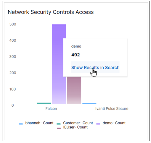
Network Security Controls Access
This column chart displays the activity of users who have access to network control systems and configuration files in your organization. It can help you monitor and investigate unfamiliar users who should not have access to these security controls.
To view the information in the chart, move your pointer over the column segments to display the values they represent. To drill down into a segment and view the underlying events, click the column and then click Show Results in Search.
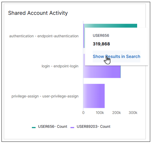
Shared Account Activity
This bar chart represents the volume of activity by users who have access to shared accounts in your organization. It can help you monitor and investigate anomalous levels of activity in those accounts to ensure that shared account usage is limited. To view the information in the chart, move your pointer over the bar segments to display the values they represent. To drill into the underlying events, click a bar and then click Show Results in Search.
Note
This visualization requires that user data is populated in the context table called Compliance - Shared Accounts.
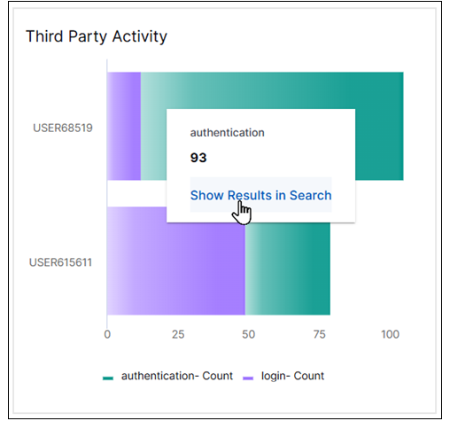
Third Party Activity
This bar chart represents the volume of third-party activity in your organization. It can help you monitor and investigate unexpected third-party access and activity. To view the information in the chart, move your pointer over the bar segments to display the values they represent. To drill into the underlying events, click the bar and then click Show Results in Search.
Note
This visualization requires that user data is populated in the context table called Compliance - Third-Party Users.
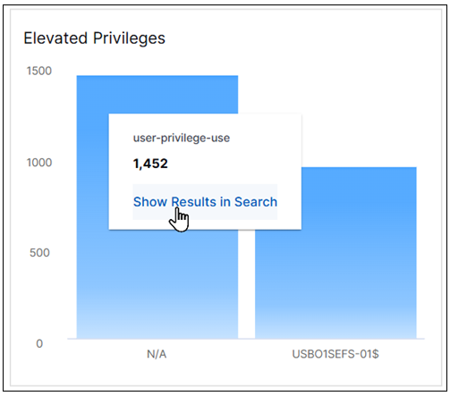
Elevated Privileges
This column chart displays the activity of users who have elevated privileges in your organization. It can help you monitor, investigate, and retain audit logs that indicate anomalous levels of activity by users with elevated privileges.
To view the information in the chart, move your pointer over the column segments to display the values they represent. To drill down into a segment and view the underlying events, click the column and then click Show Results in Search.
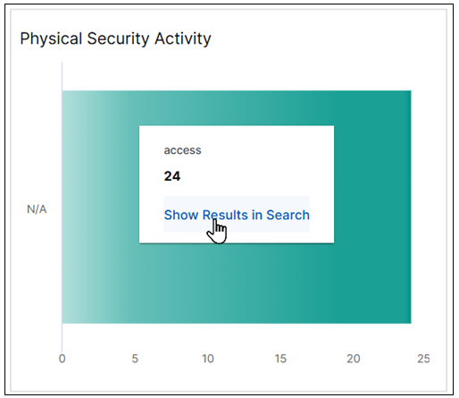
Physical Security Activity
This bar chart represents the volume of physical access activity into sensitive in-scope data environments in your organization. It can help you monitor and investigate access activities to these environments.
To view the information in the chart, move your pointer over the bar segments to display the values they represent. To drill into the underlying events, click the bar and then click Show Results in Search.
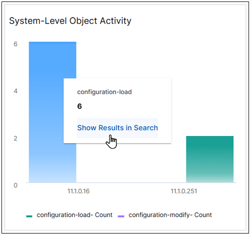
System-Level Object Activity
This column chart displays the volume of configuration activity in your organization. It can help you monitor and investigate, unexpected levels of create, delete, and modify activity in critical files and system-level objects. These activities can indicate a compromise to system security.
To view the information in the chart, move your pointer over the column segments to display the values they represent. To drill down into a segment and view the underlying events, click the column and then click Show Results in Search.
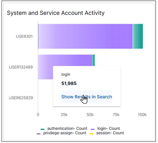
System and Service Account Activity
This bar chart represents the volume of activity in system and service accounts that require privileged access in your organization. It can help you monitor and investigate anomalous levels of activity in those accounts to ensure that access to those accounts is limited. To view the information in the chart, move your pointer over the bar segments to display the values they represen
Note
This visualization requires that user data is populated in the context table called Compliance - System & Service Accounts.
To drill into the underlying events, click the bar and then click Show Results in Search.
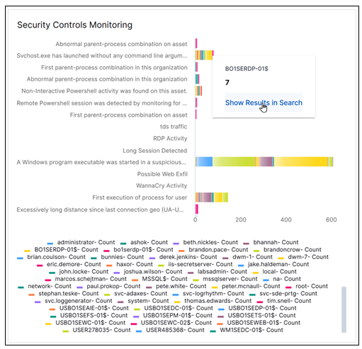
Security Controls Monitoring
This bar chart represents rule trigger activity by users in your organization. It can help you verify that appropriate security monitoring (for intrusion detection and prevention) and alerts are in place. You can use this chart to monitor and investigate anomalous levels of rule trigger activity that could indicate a security compromise.
To view the information in the chart, move your pointer over the bar segments to display the values they represent. To drill into the underlying events, click the bar and then click Show Results in Search.
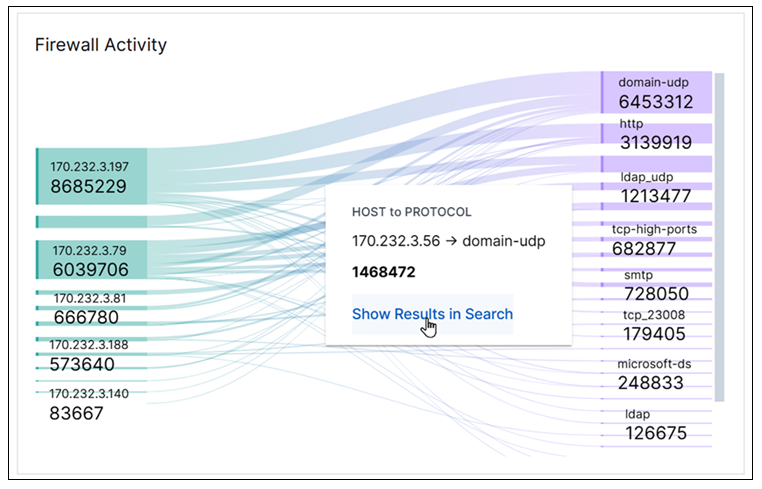
Firewall Activity
This Sankey chart breaks down the event counts for different host accounts and for security protocols (TCP, UDP, HTTPS), and illustrates the connections between them. The left side of the chart shows the host counts and the right side shows the protocol counts. This chart can help you monitor for unapproved activity in firewall services, protocols, and ports. It can be used to confirm that traffic and behavior matches expected activity. Firewall activity should be related to defined and approved business needs.
To highlight the links between the hosts and the protocols and view their count values, move your pointer over the lines that link them. To view the underlying events of a value, click the line, and then click Show Results in Search.
Firewall Changes
This pie chart illustrates the count proportions of which host accounts are making firewall configuration changes in your organization. It can help you monitor and investigate unusual change activity in your firewall configurations. These changes should be managed via a change control process.
To view the information in the chart, move your pointer over the graph slices to display the values they represent. To view the underlying events of a value, click the graph slice and then click Show Results in Search.
Malware Activity
This area chart represents the count trends of different malware-related activities by users in your organization over time. It can provide anti-malware insights to help you scan, detect, block, and remove known malware.
To view the information in the chart, move your pointer over a graph area to display the data points and their represented values. To view the underlying events of a value, click a data point, and then click Show Results in Search.