- Dashboards
- Navigation Overview
- View and Interact with an Open Dashboard
- View and Interact with an Open Visualization
- User Management
- Configure and Manage Dashboards
- Create a Dashboard
- Add a Visualization to a Dashboard
- Add a Text Tile
- Modify a Dashboard Layout
- Add Dashboard Filters
- Manage Automatic Refresh Rates
- Create a Scheduled Report
- Make a Dashboard Public
- Export and Import Dashboards
- Edit Dashboard Filters
- Edit Dashboard Details
- Duplicate a Dashboard
- Delete a Dashboard
- Configure and Manage Visualizations
- Create a Visualization
- Auto-Create a Visualization from a Natural Language Prompt
- Create a Visualization from a Search Query
- Add Visualizations from the Library to a Dashboard
- Modify a Visualization
- Configure Visualization Query Filters
- Include Context Filtering in Visualizations
- Make a Visualization Public
- Export and Import Visualizations
- Duplicate a Visualization
- Remove a Visualization from a Dashboard
- Delete Visualizations from the Library
- Configure and Manage Scheduled Reports
- Pre-Built Dashboards
- Advanced Analytics Dashboards
- AI/LLM Dashboards
- Case Manager Dashboards
- Compliance Dashboards
- Correlation Rules Dashboards
- Event Store Dashboards
- Access Grant and Revoke Activity
- Account Logout Summary
- Account Management Activity
- Application Security Event Summary
- Authenticated User Accounts on Hosts
- AWS CloudTrail Summary
- Data Loss Prevention Activity – Host-Based
- Data Loss Prevention Activity – User-Based
- Data Loss Prevention Activity Summary
- Default Account Access
- Default Credential Usage and Change Activity
- Denied Web Access Activity
- Disabled User Account Summary
- Discovered Attacks by Source and Destination
- Endpoint Detection and Response
- Failed Application Logon Activity
- Failed Audit Logs Summary
- Failed Host Login Attempt Counts by Users
- Failed VPN Login Attempts and Remote Session Timeouts
- Firewall Activity
- Firewall and Router Device Interfaces
- Insecure Authentication Attempts
- IOC Statistics
- Log Delay Insights
- Microsoft 365 Summary
- Microsoft Windows Overview
- Network Applications by Traffic Volume
- Policy Activity Summary
- Ports Usage Trend
- Privileged Access
- Privileged Access – User-Based
- Project Collateral
- Protocols by Network Traffic
- Remote Session Overview
- Security Alert Summary – Impacted Hosts
- Security Alert Summary – Origin Hosts
- Security Alert Summary – Users
- Successful Application Logon Activity
- Successful Database Login Activity
- Successful Physical Access
- Top Attackers
- User Account Creation Summary
- User Account Lockout Activity
- Vendor Authentication Activity
- Windows Audit Failure Summary by Hosts
- Windows Audit Failure Summary by Users
- Windows User Privilege Elevation
- Zscaler HTTP Dashboard
- Security Operations Center Management Dashboards
- Threat Center Dashboards
- Pre-Built Visualizations
- Agentic AI - Result
- Agentic AI - Violations
- Agentic AI by App ID
- Agentic AI Usage by Host
- Agentic AI Users - Blicked/Allowed
- Anomalies - Use Case & MITRE Coverage
- Anomalies by Rule Name
- Anomalies by Use Case
- Anomalies Count Over Time
- Anomaly Distribution by MITRE Tactic & Score
- Application Count
- Closed Incidents
- Correlation Rules by Severity
- Correlation Rules Triggered Over Time
- Detected Anomalies
- Host-Based DLP Alerts Count
- Incidents Created
- Incident Summary by Incident Type
- Number of Hosts with DLP Alerts
- SOC Incident Distribution
- Top 5 Host-Based DLP Alert Categories
- Top 5 Protocols in Host-Based DLP Alerts
- Top 10 Host-Based DLP Alert Types
- Top 10 Hosts with DLP Alerts
- Top Activities per Top 10 Applications
- Top Users per Top 10 Applications
- Trend of Application Security Events
PrevNext
SOC Incident Distribution
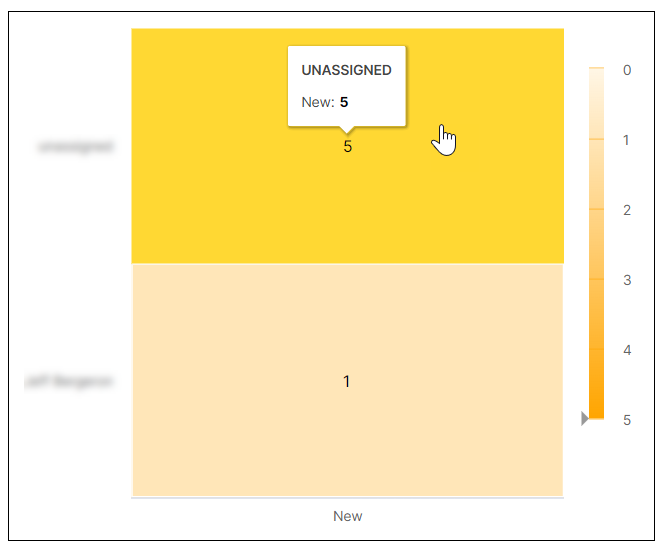
This heat map visualization breaks down the count of new incidents per assignee. Darker shading on the map indicates a greater number of incidents. To display more information about a graph value, hover your pointer over a specific square, as shown in the image below.

