- Dashboards
- Navigation Overview
- View and Interact with Dashboards
- View and Interact with Visualizations
- User Management
- Configure and Manage Dashboards
- Create a Dashboard
- Add a Visualization to a Dashboard
- Add a Text Tile
- Modify a Dashboard Layout
- Add Dashboard Filters
- Manage Automatic Refresh Rates
- Create a Scheduled Report
- Make a Dashboard Public
- Export and Import Dashboards
- Edit Dashboard Filters
- Edit Dashboard Details
- Duplicate a Dashboard
- Delete a Dashboard
- Configure and Manage Visualizations
- Create a Visualization
- Auto-Create a Visualization from a Natural Language Prompt
- Create a Visualization from a Search Query
- Add Visualizations from the Library to a Dashboard
- Modify a Visualization
- Configure Visualization Query Filters
- Include Context Filtering in Visualizations
- Make a Visualization Public
- Export and Import Visualizations
- Duplicate a Visualization
- Remove a Visualization from a Dashboard
- Delete Visualizations from the Library
- Configure and Manage Scheduled Reports
- Pre-Built Dashboards
- Advanced Analytics
- AI/LLM Dashboards
- Threat Center
- Case Manager
- Compliance / Event Store
- Access Grant and Revoke Activity Dashboard
- Account Logout Summary Dashboard
- Account Management Activity Dashboard
- Application Security Event Summary Dashboard
- Authenticated User Accounts on Hosts Dashboard
- AWS CloudTrail Summary Dashboard
- Data Loss Prevention Activity Dashboard – Host-Based
- Data Loss Prevention Activity Dashboard – User-Based
- Data Loss Prevention Activity Summary Dashboard
- Default Account Access Dashboard
- Default Credential Usage and Change Activity Dashboard
- Denied Web Access Activity Dashboard
- Disabled User Account Summary Dashboard
- Discovered Attacks by Source and Destination Dashboard
- Endpoint Detection and Response Dashboard
- Failed Application Logon Activity Dashboard
- Failed Audit Logs Summary Dashboard
- Failed Host Login Attempt Counts by Users Dashboard
- Failed VPN Login Attempts and Remote Session Timeouts Dashboard
- Firewall Activity Dashboard
- Firewall and Router Device Interfaces Dashboard
- Indicator of Compromise (IOC) Statistics Dashboard
- Insecure Authentication Attempts Dashboard
- Microsoft 365 Summary Dashboard
- Microsoft Windows Overview Dashboard
- Network Applications by Traffic Volume Dashboard
- Policy Activity Summary Dashboard
- Port Usage Trends Dashboard
- Privileged Access Dashboard
- Privileged Access Dashboard – User-Based
- Protocols by Network Traffic Dashboard
- Remote Session Overview Dashboard
- Security Alert Summary Dashboard – Impacted Hosts
- Security Alert Summary Dashboard – Origin Hosts
- Security Alert Summary Dashboard – Users
- Successful Application Logon Activity Dashboard
- Successful Database Login Activity Dashboard
- Successful Physical Access Dashboard
- Top Attackers Dashboard
- User Account Creation Summary Dashboard
- User Account Lockout Activity Dashboard
- Vendor Authentication Activity Dashboard
- Windows Audit Failure Summary by Hosts Dashboard
- Windows Audit Failure Summary by Users Dashboard
- Windows User Privilege Elevation Dashboard
- Zscaler HTTP Dashboard
- Correlation Rules
- SOC Management
- Pre-Built Visualizations
- Anomalies - Use Case & MITRE Coverage
- Anomalies by Rule Name
- Anomalies by Use Case
- Anomalies Count Over Time
- Anomaly Distribution by MITRE Tactic & Score
- Application Count
- Closed Incidents
- Correlation Rules by Severity
- Correlation Rules Triggered Over Time
- Detected Anomalies
- Host-Based DLP Alerts Count
- Incidents Created
- Incident Summary by Incident Type
- Number of Hosts with DLP Alerts
- SOC Incident Distribution
- Top 5 Host-Based DLP Alert Categories
- Top 5 Protocols in Host-Based DLP Alerts
- Top 10 Host-Based DLP Alert Types
- Top 10 Hosts with DLP Alerts
- Top Activities per Top 10 Applications
- Top Users per Top 10 Applications
- Trend of Application Security Events
Zscaler HTTP Dashboard
If you use the Zscaler ZIA Cloud Collector, you can use the pre-built Zscaler HTTP traffic dashboard to view internet activity in your organization. The dashboard enables you to view details about:
To use and customize this dashboard, see the following topics:
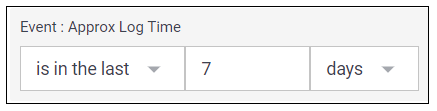
Time Range Filter
The Event : Approx Log Time filter sets the time range for the event data. The default setting is in the last 7 days. You can update this filter with a wide range of customizable settings.
To update the time range filter, click the arrow ( ) on the right, under the Edit button, to expand the filters panel. In the Event : Approx Log Time filter, select an operator from the first drop down menu and then enter or select values in the subsequent fields, depending on the operator you selected. To save your filter changes, click Apply on the right side of the filter panel. The updated filter is applied to the visualization.
Log Volume by Action
Use this graph to view the amount of logs Zscaler generates over time. To view the values represented in the chart, hover your pointer over the graph lines to display the data points.
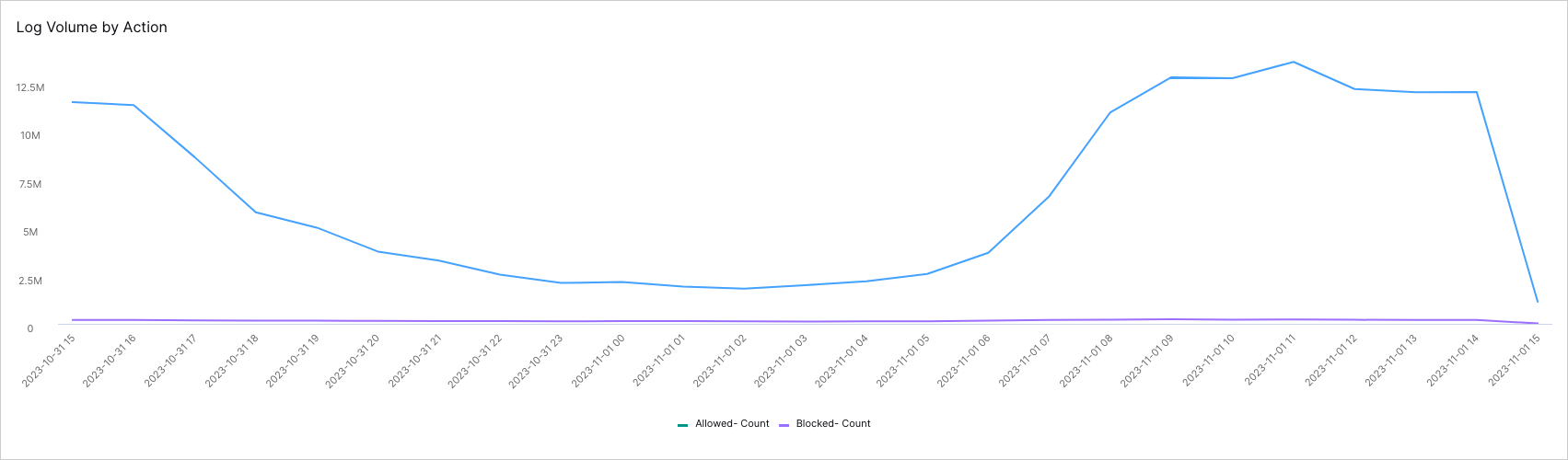 |
To view the underlying events of a value, click the data point, and then click Show Results in Search.
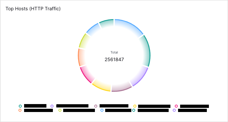
Top Hosts (HTTP Traffic)
Use this pie chart to identify the top hosts (up to 10) that are sending large amounts of HTTP traffic. The center of the chart displays the total amount of traffic (in bytes) for the selected time period. Each host segment is color-coded with corresponding labels below. You can hover over each host segment in the chart to view the amount of traffic attributed to the host. To further drill down into a host's traffic, you can select the segment and then Show Results in Search.
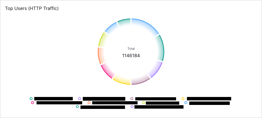
Top Users (HTTP Traffic)
Use this pie chart to identify the top users (up to 10) that are sending large amounts of HTTP traffic. The center of the chart displays the total amount of traffic (in bytes) for the selected time period. Each user segment is color-coded and with corresponding labels below the chart. You can hover over each user segment in the chart to view the amount of traffic attributed to the user. To further drill down into a user's traffic, you can select the segment and then Show Results in Search.
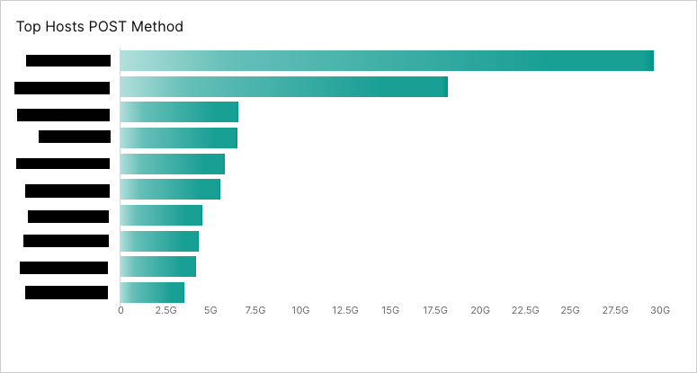
Top Hosts POST Method
Use this chart to identify hosts that are using the POST method to upload large volumes of data which can be symptomatic of data exfiltration. This chart lists the top 10 hosts in order of the total amount (in Gbps) of data uploaded for the selected time period.
Top Hosts GET Method
Use this chart to identify hosts that are using the GET method to download large volumes of data. This chart lists the top 10 hosts in order of the total amount (in Gbps) of data downloaded for the selected time period.
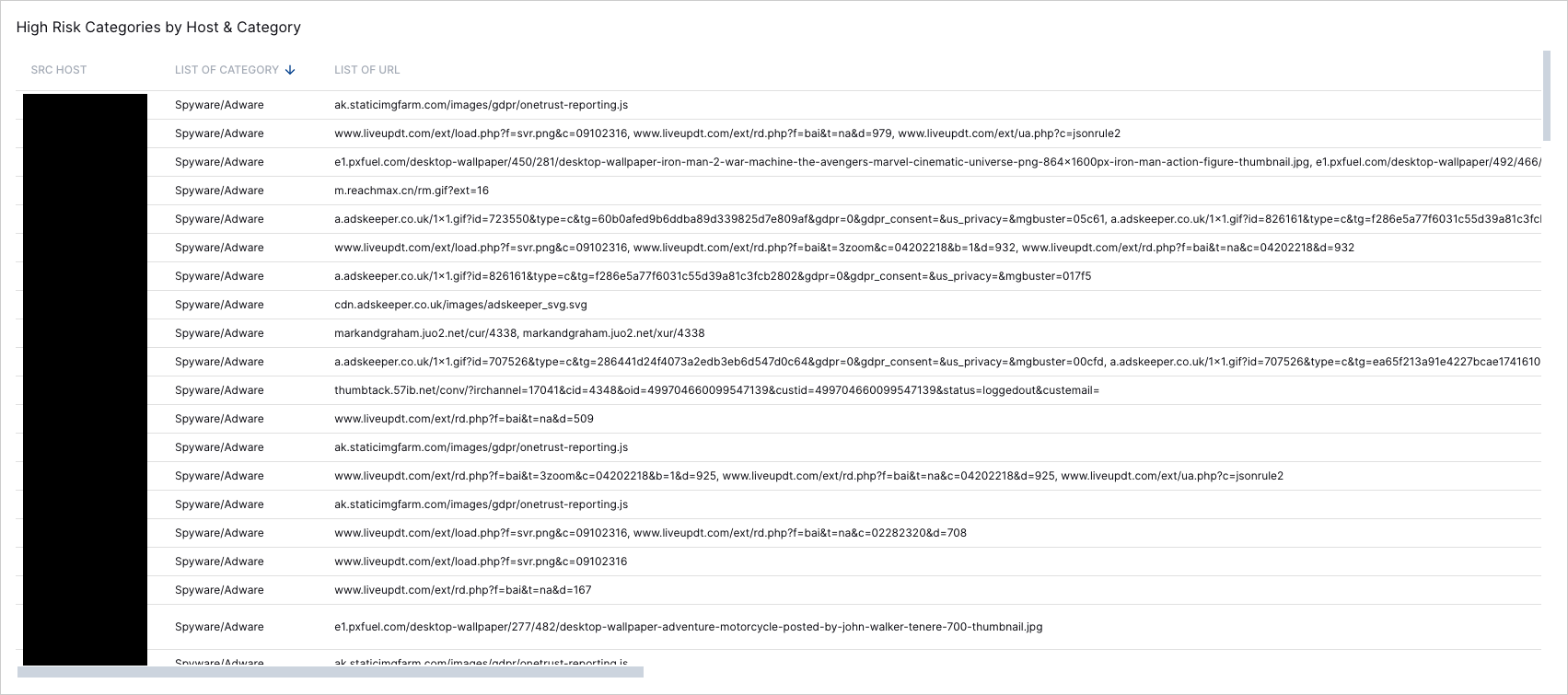
High Risk Categories by Host & Category
Use this table to threat hunt to determine why a host is identified as high-risk. For each source host, you can view the corresponding high risk category, and the URLs associated with the high risk behavior.
 |